
HoReCa & Food
AGRONOM-SAD
A storytelling promo website for an apple brand, using mascot design and UX/UI to help customers understand varieties and buy with confidence.
context
People usually choose apples quickly and almost randomly, green for something sour, red for baking, or simply the one that looks fine.
That changed when “Sobranо v sadu”, the first apple-focused brand, approached us with a need for a promotional website that would both represent the brand online and educate users about apples in a more engaging way. Unlike typical producers, they treat apples as something worth explaining and exploring, helping people better understand variety, taste, and origin.
That changed when “Sobranо v sadu”, the first apple-focused brand, approached us with a need for a promotional website that would both represent the brand online and educate users about apples in a more engaging way. Unlike typical producers, they treat apples as something worth explaining and exploring, helping people better understand variety, taste, and origin.

goals
Build a memorable promo website for the apple brand. Strengthen product understanding and variety awareness. Present apple varieties in a clear and structured way. Support a more premium and adult perception of the brand. Connect online and offline through QR codes on the packaging that lead users to additional content. Make the brand more engaging and emotionally distinctive. Increase product conversion by improving decision-making clarity at the point of selection. Support higher purchase intent through better product storytelling and differentiation. Reduce friction in consumer choice between apple varieties, driving more confident and faster purchasing decisions.

The Insight
The core issue was not awareness of apples, it was the lack of language to describe them. Most competitors communicate in a functional, transactional way, without helping users understand differences between varieties or their culinary potential.
We realized that if apples were treated like a "story-driven product category," users would not only recognize differences but also develop preference, curiosity, and trust. This shift directly impacts purchasing behavior. When people understand what they're choosing, they are more likely to buy, and more likely to return for specific varieties.
This led to the idea of turning each apple variety into a small narrative, something between a product description and a short story, where taste, origin, and use cases become part of a coherent experience.
The Process
We started with pre concept exploration, developing two radically different creative directions before final production began. Both explored how apples could be positioned beyond a simple grocery product, either through a structured terroir inspired premium lens or through a more poetic story driven fairy tale garden approach inspired by literary motifs. The chosen direction leaned into the second concept, where the website becomes a kind of digital orchard.
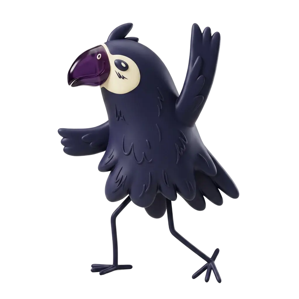
The visual language was built around calm illustrative storytelling, inspired by botanical illustrations, old books, and a soft nostalgic atmosphere. A key part of the system was the introduction of a site mascot, a hedgehog character already present in the brand packaging. We reworked it into a more mature digital guide designed to lead users through the website and introduce each apple variety with short contextual remarks. The mascot also became a bridge between offline packaging and the digital experience through QR codes on the packaging that lead users to online content.
The visual language was built around calm illustrative storytelling, inspired by botanical illustrations, old books, and a soft nostalgic atmosphere. A key part of the system was the introduction of a site mascot, a hedgehog character already present in the brand packaging. We reworked it into a more mature digital guide designed to lead users through the website and introduce each apple variety with short contextual remarks. The mascot also became a bridge between offline packaging and the digital experience through QR codes on the packaging that lead users to online content.


We then structured the site as a multi layer narrative system with a main page, a brand story section, and individual pages for each apple variety. Each variety page was designed as a self contained mini story combining origin, flavor description, texture, aroma, and recommended use cases such as baking, salads, or everyday consumption. The design process went through multiple iterations balancing storytelling, readability, and performance, resulting in a system with more visual space, restrained color usage, and subtle handwritten accents that reinforced the brand tone without overwhelming the user experience.
The Result
The final website became more than a digital presentation of the brand. It turned into a structured storytelling ecosystem where product understanding naturally guided user behavior. By translating apple varieties into clear and emotionally engaging narratives, we reduced hesitation at the moment of choice and made selection feel more intuitive.
This clarity had a direct impact on business performance. Users could navigate products faster, understand differences more easily, and make more confident purchase decisions, which supported higher conversion potential across product pages and improved the overall efficiency of the catalog.
At the same time, the brand gained a more premium and coherent digital presence where storytelling, design, and product logic worked as one system. The website strengthened trust, increased engagement with individual apple varieties, and created a scalable framework for future product communication and promotion.
