
HORECA&FOOD
WAKE & SHAKE
A dual-personality brand identity for Wake&Shake, a cozy café by day and a lively cocktail bar by night. Two mascots, one visual system.
context
Wake&Shake isn't your typical café. By day, it's a calm, welcoming space built around fresh croissants, good coffee, and unhurried mornings. By night, the lights dim, the music picks up, and it becomes a cocktail bar with a completely different energy. Same address, two totally different experiences. The Client came to us with a name, a concept, and a finished interior design, and a clear sense of what the brand needed to do. They wanted an identity that wouldn't just nod at the day-to-night duality, but actually embody it. Every visual element, every touchpoint had to make that double life immediately readable, and genuinely exciting for both audiences, increasing relevance and visit frequency across different times of day.

goals
Build a distinctive brand identity around the café's dual concept. Create an emotional connection with two different audience moods. Ensure visual consistency across all touchpoints, from cups to social media. Harmonize the identity with the existing interior design. Support the venue's market entry with a clear, differentiated brand presence that increases foot traffic and improves conversion from first-time visitors to repeat guests.

The Insight
The contrast between morning and evening was not softened, but established as the central brand idea. Contrast became the organizing principle behind every design decision: the mascots, the palette, the logo, the tone of voice. That framing gave the venue a distinct identity in the morning market and an equally distinct one at night, without needing two separate brands to do it.
The Process
We started with the concept that was already there, duality, and asked how far we could push it before it stopped feeling cohesive.
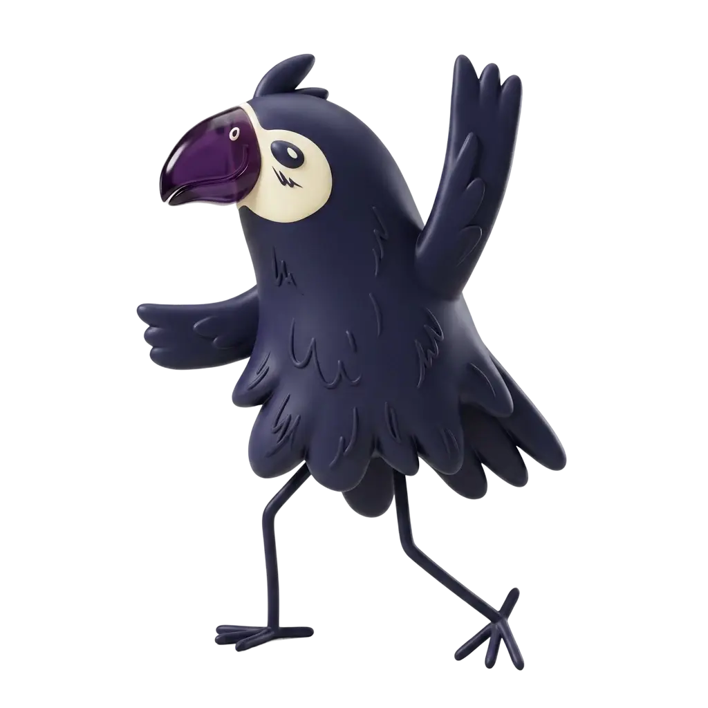
The mascots became the clearest expression of that idea. An owl for the calm, introverted energy of morning, and a parrot for the loud, extroverted charge of the night. Two distinct personalities anchored to two distinct dayparts, held together under one brand. Guests can pick a side, or claim both.
The mascots became the clearest expression of that idea. An owl for the calm, introverted energy of morning, and a parrot for the loud, extroverted charge of the night. Two distinct personalities anchored to two distinct dayparts, held together under one brand. Guests can pick a side, or claim both.


From there, we built a modular visual system designed to flex. The color palette splits into a morning register and an evening register, but the two are tuned to work together rather than clash. Textures, finishes, and tones were pulled directly from the interior design, so the brand and the physical space feel like they grew from the same idea, because they did.
The logo carries the same logic: calm and energy held in one mark, neither one overpowering the other. And every piece of collateral, menus, cups, banners, social templates, was designed to shift between moods without losing the thread that ties it all together.
The logo carries the same logic: calm and energy held in one mark, neither one overpowering the other. And every piece of collateral, menus, cups, banners, social templates, was designed to shift between moods without losing the thread that ties it all together.

The Result
Wake&Shake launched with a brand identity that makes its concept impossible to miss, and hard to forget. The dual visual system gives the venue a way to speak to two completely different guest mindsets without ever feeling inconsistent or split, helping maximize engagement across both daytime and nighttime audiences.
The Client received a full, scalable asset library covering every touchpoint: menus, cups, banners, and a social media template kit built to adapt the daily mood shift without extra design work each time, significantly reducing ongoing design and content production effort. The identity also integrates seamlessly with the existing interior, so the experience feels continuous from the moment a guest walks in, strengthening conversion from walk-in interest to in-venue spending.
The Client received a full, scalable asset library covering every touchpoint: menus, cups, banners, and a social media template kit built to adapt the daily mood shift without extra design work each time, significantly reducing ongoing design and content production effort. The identity also integrates seamlessly with the existing interior, so the experience feels continuous from the moment a guest walks in, strengthening conversion from walk-in interest to in-venue spending.
